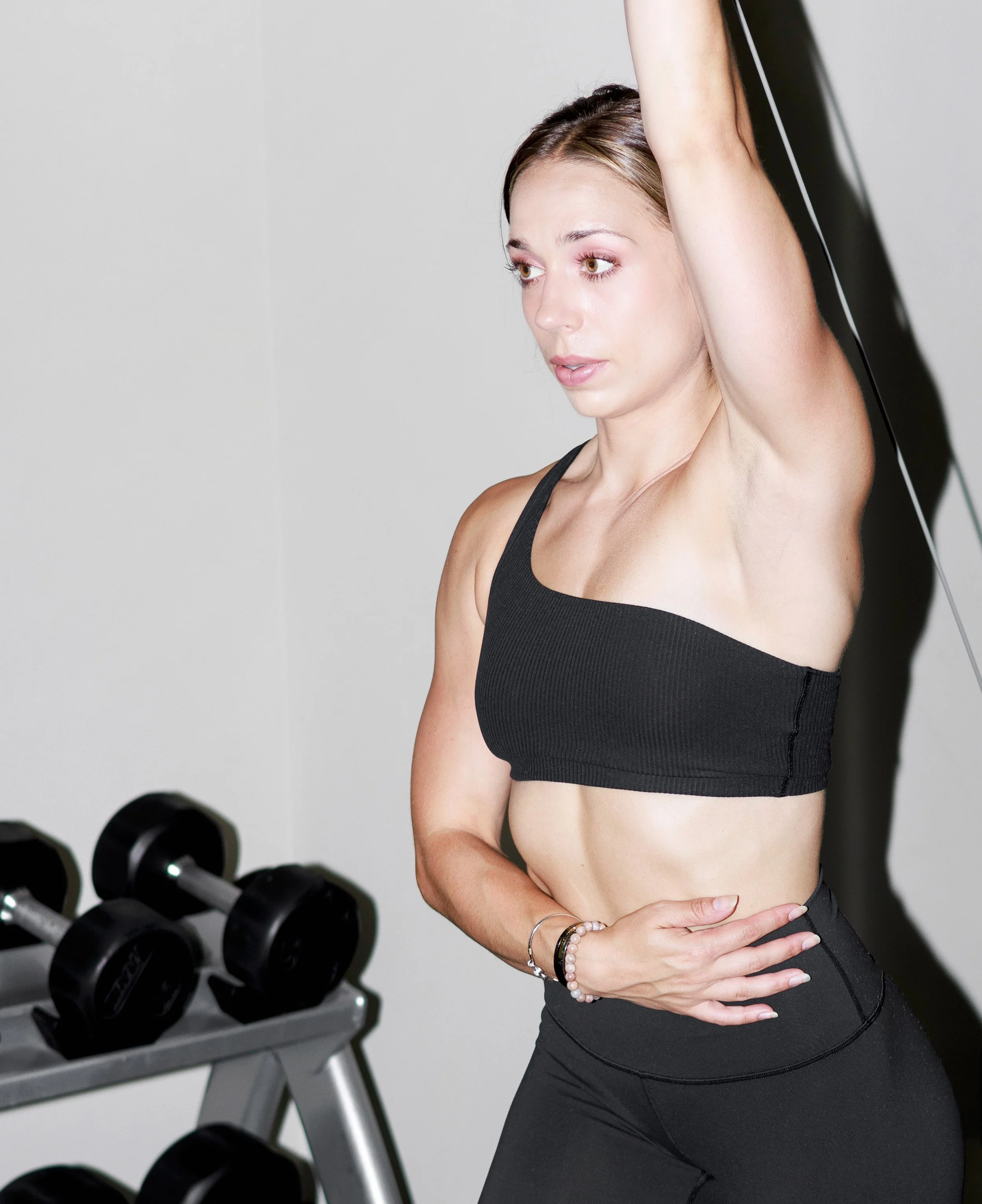
Executed brand development of a personal trainer’s brand from initial concept to final. This project involved an initial photography session to capture the trainer's style, followed by the creation of a distinctive logo and website design. I conducted extensive research to define the brand's essence, which informed all visual and textual content, ensuring a cohesive identity that effectively communicates the trainer’s cycle-syncing approach.
-
For the "Fitter Period" brand, I developed a logo that pairs a bold, black typeface with a pink dot, symbolizing the period in the brand name. This minimalist design effectively communicates precision and finality, a core aspect of the client’s fitness philosophy.
The straightforward yet powerful visual ensures the logo is instantly recognizable, perfectly suited for diverse applications from web to print.

-
I crafted a sleek and functional interface for the "Fitter Period" website, emphasizing usability and aesthetic coherence with the brand's visual identity. The design incorporates a responsive layout for optimal viewing across devices, featuring a streamlined navigation system that enhances user experience.
Strategic placement of calls to action and a thoughtful user journey facilitate easy access to the trainer's services and resources, ensuring the site supports the brand's mission to integrate fitness with hormonal health.


